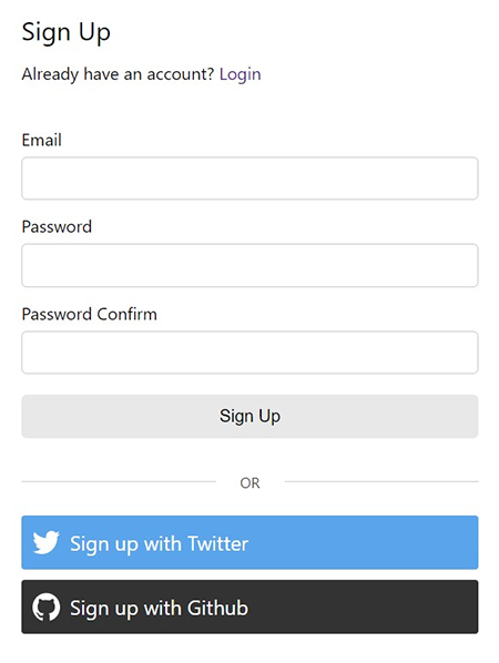
Signup
Customizable React signup component that validates against a default or custom Zod schema.
Features
- Displays and handles client and serverside errors
- Custom fields and schema
- Show a success component and/or provide an onSuccess function to redirect, set state, etc.
- Show social logins either above or below email signup with optional separator
- Custom header/footer
- Loader (default or custom)
- Show a link to login
- Client router support for links
- Toast support
Demo
https://npm-library-demo.vercel.app/signup
Install
- npm
- Yarn
- pnpm
npm install @unleashit/signup
yarn add @unleashit/signup
pnpm add @unleashit/signup
Peer dependencies: react, react-hook-form, @hookform/resolvers and zod.
Example
import Signup, { FormValues, ServerResponse } from '@unleashit/signup';
import { useNavigate } from 'react-router-dom';

function SignupDemo() {
  const navigate = useNavigate();

  const signupHandler = async (values: FormValues): Promise<ServerResponse> => {
    // server should return a ServerResponse
    // success property of true indicates all validations pass
    // errors named after field names will display with fields
    // error with property of "root" will display at the top or sent to toast
    return await fetch('https://api.example.com/signup', {
      method: 'POST',
      headers: {
        'Content-Type': 'application/json',
      },
      body: JSON.stringify(values),
    }).then((resp) => resp.json());
  };

  const onSuccess = (resp: ServerResponse) => {
    // Redirect or set auth state, etc.
    // resp has full server response from signupHandler()
    navigate('/');
  };

  return (
    <Signup handler={signupHandler} onSuccess={onSuccess} />
  );
}
Social Sign up
Adding social sign up buttons is easy. Simply include them as children and they will display (by default) under the main login with a nice separator.
import { GithubLoginButton, TwitterLoginButton } from 'react-social-login-buttons';

<Signup handler={/* ... */}>
  <TwitterLoginButton onClick={() => alert('Hello')}>
    Sign up with Twitter
  </TwitterLoginButton>
  <GithubLoginButton onClick={() => alert('Hello')}>
    Sign up with Github
  </GithubLoginButton>
</Signup>
Custom Fields
You can easily customize the form fields, attribute, behavior and more my supplying a custom fields object and a zod schema to match. See Custom Fields for more info.
CSS
By default, all components come with basic css styling in two formats: standard (BEM namespaced) and a CSS Module friendly version.
To use the standard version, import it like: import '@unleashit/signup/dist/signup.css'. Or if you are using CSS Modules you can import css from '@unleashit/signup/dist/signup.module.css' and provide to the cssModule prop and/or use your own custom module targeting the internal class names.
See styling-and-theming for more info.
CSS Custom Properties
You can get pretty far without having to write any custom CSS. By supplying a cssVars prop, you can override any of the CSS variables of the default css.
See styling-and-theming for more info.
Dark mode
Setting the darkMode prop activates dark mode.
See Dark Mode for more info.
API
SignupProps (extends BaseFormProps)
Props for the Signup component. SignupFormProps extends BaseFormProps. The only required prop is handler.
export type SignupProps = BaseFormProps & {
  /**
   * Override the login link inside the default header
   * Note: if you provide a header prop, the login link will not appear
   */
  loginLink?: ComponentType | ReactNode;
  /**
   * Add a separator between email and
   * social logins  (children required)
   */
  orLine?: boolean;
  /** CSS custom property overrides */
  cssVars?: CSSVars<typeof varNames>;
  /** Position of children */
  children?: ReactNode;
  /** Social logins or other content to display */
  childrenPosition?: 'top' | 'bottom';
};
export type BaseFormProps = {
  /** Handler to submit form. Receives form values and returns Promise with ServerResponse */
  handler: <T extends ZodTypeAny>(
    values: FormValues<T>,
    event?: Event,
  ) => Promise<BaseServerResponse<FormValues<T>>>;
  /** Handler that fires upon successful server validation */
  onSuccess?: <T extends ZodTypeAny, Meta extends Record<string, any>>(
    resp: BaseServerResponse<FormValues<T>, Meta>,
  ) => void;
  /**
   * Custom header component or
   * false to disable the default header
   */
  header?: ComponentType<any> | ReactNode | false;
  /** Header text for default header */
  headerText?: string;
  /** Custom loader component */
  loader?: ComponentType<DefaultLoaderProps>;
  /** Label for form submit button */
  buttonText?: string;
  /** Custom fields to override default fields */
  customFields?: CustomField[];
  /** Custom schema to override default schema */
  customSchema?:
    | z.ZodObject<any, any, any, any, any>
    | z.ZodEffects<any, any, any>;
  /**
   * Optionally send root server error message and/or
   * handler exceptions to toast
   */
  toast?: (msg: string) => void;
  /** Override the default catch error shown to user */
  failMsg?: string;
  /** Override or remove the default success message */
  successMessage?: ComponentType<any> | string | false;
  /** Disable/override initial form focus if set */
  isFocused?: boolean;
  /**
   * Boolean to toggle component's data-theme attribute
   * between light and dark mode
   */
  darkMode?: boolean;
  /** CSS module to target internal styles */
  cssModule?: Record<string, string>;
};
ServerResponse
handler function's promise should resolve a ServerResponse.
export type ServerResponse<
  TFormValues extends Record<string, any> = FormValues,
  Meta extends Record<string, any> = Record<string, any>,
> = BaseServerResponse<TFormValues, Meta>;
export type BaseServerResponse<
  TFormValues extends Record<string, string | string[]> = Record<string, any>,
  Meta extends Record<string, any> = Record<string, any>,
> = {
  /* success key informs client whether server validation passed or failed */
  success: boolean;
  /* errors only display if success=false */
  errors?: {
    /* Optional error msg to print in header
     * or send to toast when server validation fails
     */
    root?: string | string[];
    /*
     * pass any failing formValues
     * as key=name of field, value=message or array of messages to print
     */
  } & Partial<TFormValues>;
} & Meta;