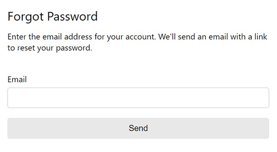
Forgot Password
Customizable set of React forgot password components that validate against a default or custom Zod schema. Accepts custom fields and includes reset request, token submission and confirmation views as needed.
Features
- Displays and handles client and serverside errors
- Custom fields and schema
- Show success components and/or provide onSuccess functions to redirect, set state, etc.
- Custom header/footer
- Loader (default or custom)
- Show a link to login instead
- Client router support for links
- Toast support
Demo
https://npm-library-demo.vercel.app/forgot-password
Install
- npm
- Yarn
- pnpm
npm install @unleashit/forgot-password
yarn add @unleashit/forgot-password
pnpm add @unleashit/forgot-password
Peer dependencies: react, react-hook-form, @hookform/resolvers and zod.
Password Reset Request Example
import ForgotPassword, {
  FormValues,
  ServerResponse,
} from '@unleashit/forgot-password';

function ForgotPasswordDemo() {
  const forgotPasswordHandler = async (
    values: FormValues,
  ): Promise<ServerResponse> => {
    // server should return a ServerResponse
    // success property of true indicates all validations pass
    // errors named after field names will display with fields
    // error with property of "root" will display at the top or sent to toast
    return await fetch('https://api.example.com/forgot-password', {
      method: 'POST',
      headers: {
        'Content-Type': 'application/json',
      },
      body: JSON.stringify(values),
    }).then((resp) => resp.json());
  };

  const onSuccess = (resp: ServerResponse) => {
    // Redirect or set state, etc.
    // resp has full server response from forgotPasswordHandler()
    console.log(resp);
  };

  return (
    <ForgotPassword handler={forgotPasswordHandler} onSuccess={onSuccess} />
  );
}
Note that onSuccess is optional. By default, the user will be shown a generic success message as long as the server returns a success boolean. If you provide an successMessage prop, you can override it or set false to turn off.
Password Reset Example
import ForgotPasswordReset, {
  FormValuesReset,
  ServerResponseReset,
} from '@unleashit/forgot-password';

function ForgotPasswordResetDemo() {
  const forgotPasswordResetHandler = async (
    values: FormValuesReset,
  ): Promise<ServerResponseReset> => {
    // userID and token are extracted from url
    const [token, userid] = new URL(window.location.href).pathname
      .split('/')
      .filter(Boolean)
      .reverse();

    return await fetch(
      `https://api.example.com/forgot-password/${userid}/${token}`,
      {
        method: 'POST',
        headers: {
          'Content-Type': 'application/json',
        },
        body: JSON.stringify(values),
      },
    ).then((resp) => resp.json());
  };

  const onSuccess = (resp: ServerResponseReset) => {
    console.log(resp);
  };

  return (
    <ForgotPasswordReset
      handler={forgotPasswordResetHandler}
      onSuccess={onSuccess}
    />
  );
}
In this example, the userId and authorization token are taken from the url under the assumption the user arrived from a link sent via email or SMS. By default (can be customized or turned off with a successMessage prop), a success message will be shown to the user if the server returns a positive response with no errors.
Custom Fields
You can easily customize the form fields, attribute, behavior and more my supplying a custom fields object and a zod schema to match. See Custom Fields for more info.
CSS
By default, all components come with basic css styling in two formats: standard (BEM namespaced) and a CSS Module friendly version.
To use the standard version, import it like: import '@unleashit/forgot-password/dist/forgot-password.css'. Or if you are using CSS Modules you can import css from '@unleashit/forgot-password/dist/forgot-password.module.css' and provide to the cssModule prop and/or use your own custom module targeting the internal class names.
See styling-and-theming for more info.
CSS Custom Properties
You can get pretty far without having to write any custom CSS. By supplying a cssVars prop, you can override any of the CSS variables of the default css.
See styling-and-theming for more info.
Dark mode
Setting the darkMode prop activates dark mode.
See Dark Mode for more info.
API
ForgotPasswordProps (extends BaseFormProps)
Props for forgot password request.
export type ForgotPasswordProps = BaseFormProps & {
  /**
   * Override the login link inside the default header
   * Note: if you provide a header prop, the login link will not appear
   */
  loginLink?: ComponentType | ReactNode;
  /** CSS custom property overrides */
  cssVars?: CSSVars<typeof varNames>;
  /** Position of children */
  childrenPosition?: 'top' | 'bottom';
  /** Other content to display */
  children?: ReactNode;
};
export type BaseFormProps = {
  /** Handler to submit form. Receives form values and returns Promise with ServerResponse */
  handler: <T extends ZodTypeAny>(
    values: FormValues<T>,
    event?: Event,
  ) => Promise<BaseServerResponse<FormValues<T>>>;
  /** Handler that fires upon successful server validation */
  onSuccess?: <T extends ZodTypeAny, Meta extends Record<string, any>>(
    resp: BaseServerResponse<FormValues<T>, Meta>,
  ) => void;
  /**
   * Custom header component or
   * false to disable the default header
   */
  header?: ComponentType<any> | ReactNode | false;
  /** Header text for default header */
  headerText?: string;
  /** Custom loader component */
  loader?: ComponentType<DefaultLoaderProps>;
  /** Label for form submit button */
  buttonText?: string;
  /** Custom fields to override default fields */
  customFields?: CustomField[];
  /** Custom schema to override default schema */
  customSchema?:
    | z.ZodObject<any, any, any, any, any>
    | z.ZodEffects<any, any, any>;
  /**
   * Optionally send root server error message and/or
   * handler exceptions to toast
   */
  toast?: (msg: string) => void;
  /** Override the default catch error shown to user */
  failMsg?: string;
  /** Override or remove the default success message */
  successMessage?: ComponentType<any> | string | false;
  /** Disable/override initial form focus if set */
  isFocused?: boolean;
  /**
   * Boolean to toggle component's data-theme attribute
   * between light and dark mode
   */
  darkMode?: boolean;
  /** CSS module to target internal styles */
  cssModule?: Record<string, string>;
};
ForgotPasswordResetProps
Props for password reset.
export type ForgotPasswordResetProps = BaseFormProps & {
  /** CSS custom property overrides */
  cssVars?: CSSVars<typeof varNames>;
  /** Position of children */
  childrenPosition?: 'top' | 'bottom';
  /** Other content to display */
  children?: React.ReactNode;
};