Modal
Customizable React modal component. Optional animation support when adding/removing from DOM.
Features
- Lightweight modal component.
- Animation support: optionally adds animation classes when adding/removing from DOM.
- Custom header and/or footer.
- Portal free. Detects the highest z-index to place modal above other elements without having to insert markup at the root.
- Default CSS with light/dark mode available
- CSS module support can override internal styles with a custom module.
Demo
https://npm-library-demo.vercel.app/modal
Install
- npm
- Yarn
- pnpm
npm install @unleashit/modal
yarn add @unleashit/modal
pnpm add @unleashit/modal
Example
const ModalDemo = () => {
const [modalOpen, setModalOpen] = useState(false);
const toggleModal = () => {
setModalOpen(!modalOpen);
};
return (
<>
<p>
Lorem ipsum dolor sit amet consectetur adipisicing elit. Aperiam numquam
praesentium quisquam repudiandae impedit architecto sapiente consequatur
voluptate vitae quis? Pariatur ad fuga fugiat, nostrum ipsa officia
eveniet debitis ipsum assumenda labore maiores aspernatur soluta
mollitia fugit itaque.
</p>
<button onClick={toggleModal} type="button">
open sesame!
</button>
<Modal
size="medium"
isOpen={modalOpen}
onClose={toggleModal}
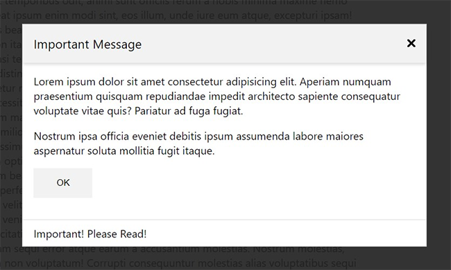
header="Important Message"
footer={() => <footer>Important! Please Read!</footer>}
overlayColor="rgba(0,0,0,.8)"
>
<p>
Lorem ipsum dolor sit amet consectetur adipisicing elit. Aperiam
numquam praesentium quisquam repudiandae impedit architecto sapiente
consequatur voluptate vitae quis? Pariatur ad fuga fugiat.
</p>
<div>
<button type="button" onClick={toggleModal}>
OK
</button>
</div>
</Modal>
</>
);
};
export default ModalDemo;
CSS
By default, all components come with basic css styling in two formats: standard (BEM namespaced) and a CSS Module friendly version.
To use the standard version, import it like: import '@unleashit/modal/dist/modal.css'. Or if you are using CSS Modules you can import css from '@unleashit/modal/dist/modal.module.css' and provide to the cssModule prop and/or use your own custom module targeting the internal class names.
See styling-and-theming for more info.
CSS Custom Properties
You can get pretty far without having to write any custom CSS. By supplying a cssVars prop, you can override any of the CSS variables of the default css.
See styling-and-theming for more info.
Dark mode
Setting the darkMode prop activates dark mode.
See Dark Mode for more info.
API
ModalProps
Props for the modal component. isOpen is the only required prop although the modal will be empty unless at least children, header and/or footer are provided.
export type OverlayColor =
  /** Configure both light/dark mode colors */
  | {
      light: string;
      dark: string;
    }
  /** One overlay color regardless of light/dark mode */
  | string
  /** Transparent overlay */
  | false;

export interface ModalProps {
  /** Modal state */
  isOpen: boolean;
  /** Size of the modal, either as a preset or a custom CSS size */
  size?:
    | 'small'
    | 'medium'
    | 'large'
    | 'full'
    | `${number}${(typeof cssUnits)[number]}`;
  /** Handler to close the modal. Use to set the modal state */
  onClose?: (e?: React.MouseEvent) => void;
  /** CLose modal on overlay click */
  closeOnOverlayClick?: boolean;
  /**
   * When the modal opens/closes, add animation classes and
   * preserve the modal in the DOM for the length of a timeout
   */
  animationSupport?: boolean;
  /** Time in milliseconds to keep the modal in the DOM and animation classes active */
  animationCloseTimeout?: number;
  /** Custom header component */
  header?: React.FC<any> | string;
  /** Custom footer component */
  footer?: React.FC<any> | string;
  /** Color of the overlay */
  overlayColor?: OverlayColor;
  /** Add a close button to the header */
  closeBtn?: boolean;
  /**
   * Boolean to toggle component's data-theme attribute
   * between light and dark mode
   */
  darkMode?: boolean;
  /** CSS custom property overrides */
  cssVars?: CSSVars<typeof varNames>;
  /** CSS module to target internal styles */
  cssModule?: Record<string, string>;
  /** The main content of the modal */
  children?: React.ReactNode;
}