Navigation
Customizable navigation component for React. Comes with optional sidecar component for login/logout/signup.
Features
- Lightweight UI component. Send it a list of links and options, and it will render the html.
- Horizontal or Vertical display.
- Can independently control display state of each link.
- Optional login/logout/signup sidecar can be positioned independently from main links.
- Accepts custom attributes per link.
- Several CSS themes to choose, or make your own.
- CSS module support can override internal styles with a custom module.
Demo
https://npm-library-demo.vercel.app/navigation
Install
- npm
- Yarn
- pnpm
npm install @unleashit/navigation
yarn add @unleashit/navigation
pnpm add @unleashit/navigation
Example without auth links
const links: NavigationLink[] = [
  {
    title: 'Home',
    href: '/home',
  },
  {
    title: 'Products',
    href: '/products',
  },
  {
    title: 'About',
    href: '/about-us',
  },
  {
    title: 'Partner Site',
    href: 'https://example.com',
    attrs: {
      target: '_blank',
      rel: 'noopener noreferrer',
    },
  },
];

const NavigationDemo = () => <Navigation links={links} />;

export default NavigationDemo;
Authenticated Links
You can manually manage the display state for each link with by adding a display property. Setting a display property will always override any managed link state the component does.
const links: NavigationLink[] = [
  {
    title: 'Members Only',
    href: '/members',
    display: isLoggedIn && isMember, // boolean
  },
];
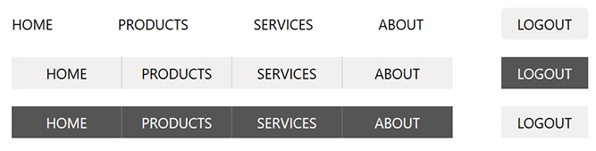
Login/Logout/Signup Sidecar
If you include an isAuth and/or authLinks prop, a sub-component with appear with authentication and signup links as appropriate. Use isAuth if you have a simple prototype with standard login/logout/signup behavior. authLinks is a customized version. Lastly if you prefer, you can integrate your auth buttons directly into the primary links using the display property to individually show/hide.
If isAuth is included and set to false, both login and signup will show up. If true, logout instead.
If you need to customize the titles, urls or anything about the auth links (you probably do), an authLinks prop is required. authLinks should be an object with login, logout and signup properties each containing a NavigationLink object (see NavigationLink below).
interface AuthLinkTypes {
  login?: NavigationLink;
  logout?: NavigationLink;
  signup?: NavigationLink;
}

const authLinks: AuthLinkTypes = {
  login: {
    title: 'Sign In',
    href: '/login',
  },
  logout: {
    title: 'Logout',
    href: '/logout',
  },
  signup: {
    title: 'Register',
    href: '/signup',
    icon: '/images/login-icon.svg',
    iconPosition: 'right', // left is default
  },
};

<Navigation
  links={links}
  authLinks={authLinks}
  isAuth={false}
  template="light-buttons"
/>;
Note: If you add authlinks, including isAuth is optional. Including it is a simple way to control display state, but you can also choose to manage individually per link if you prefer:
const authLinks: AuthLinkTypes = {
  login: {
    display: !isLoggedIn,
    // you can leave off any props if you like the defaults
  },
  logout: {
    display: isLoggedIn,
  },
  signup: {
    display: false, // never display signup
  },
};
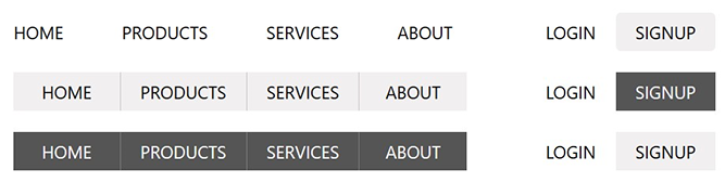
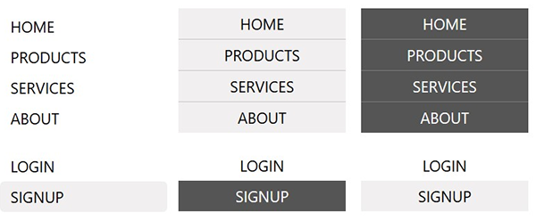
Default Themes
If you include the default CSS, you can choose from a few basic themes by setting the template prop:
clean: clean style. This is the defaultlight-buttons: light buttons styledark-buttons: dark buttons styleplain: no style (same as not adding the CSS but it adds a class calledplain)
You can also set the direction to be horizontal or vertical with the direction prop. The themes are designed to work in either direction.
Lastly, you can optionally add an icon to any link by setting the icon and iconPosition props. Depending on the icon dimensions, you may or may not have to tweak the CSS to get the right results.
CSS
By default, all components come with basic css styling in two formats: standard (BEM namespaced) and a CSS Module friendly version.
To use the standard version, import it like: import '@unleashit/navigation/dist/navigation.css'. Or if you are using CSS Modules you can import css from '@unleashit/navigation/dist/navigation.module.css' and provide to the cssModule prop and/or use your own custom module targeting the internal class names.
See styling-and-theming for more info.
CSS Custom Properties
You can get pretty far without having to write any custom CSS. By supplying a cssVars prop, you can override any of the CSS variables of the default css.
See styling-and-theming for more info.
Dark mode
Setting the darkMode prop activates dark mode.
See Dark Mode for more info.
API
NavigationProps
Props for the Navigation component.
export interface NavigationProps {
  /** Object with links configuration */
  links: NavigationLink[];
  /**
   * Optional client router component.
   * When supplied, links will be constructed with it.
   * By default, links will be HTML anchor tags.
   */
  linkComponent?: ComponentType<any>;
  /**
   * Designate a non-standard href prop if the Router
   * uses one. Example: React Router Link uses "to"
   */
  linkComponentHrefAttr?: string;
  /** Vertical or horizontal links */
  direction?: 'horizontal' | 'vertical' | 'horz' | 'vert';
  /** Choice of template */
  template?: 'clean' | 'light-buttons' | 'dark-buttons' | 'none';
  /** Optional CSS classes to add to Navigation container */
  classes?: string[];
  /**
   * Show the auth sidecar. When set to true, a logged in state
   * false logged out. Omit or set undefined to not display
   */
  isAuth?: boolean;
  /** Customize the auth sidecar */
  authLinks?: AuthLinkTypes;
  /**
   * Boolean to toggle component's data-theme attribute
   * between light and dark mode
   */
  darkMode?: boolean;
  /** CSS custom property overrides */
  cssVars?: CSSVars<typeof varNames>;
  /** CSS module to target internal styles */
  cssModule?: Record<string, string>;
}
NavigationLink
Individual navigation links.
export interface NavigationLink {
  href: string;
  title: string;
  active?: boolean;
  classes?: string[];
  style?: React.CSSProperties;
  icon?: string;
  iconPosition?: 'left' | 'right';
  display?: boolean;
  attrs?: React.AllHTMLAttributes<any>;
}
AuthLinkTypes
AuthLinks are an object with login, logout and/or signup keys. Each value is a NavigationLink. The display titles can be changed by setting the title in each NavigationLink.
export interface AuthLinkTypes {
  login?: NavigationLink;
  logout?: NavigationLink;
  signup?: NavigationLink;
}