Quick Form
Quick Form is a form builder that lets you crank out simple forms fast. It's a wrapper for React Hook Form that handles much of the manual setup while still providing enough customization for typical needs. It produces the form based on a configuration, handles both client and server* validation and comes with basic styling.
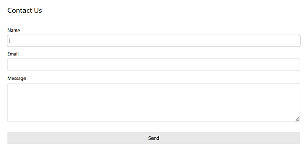
* When no config or schema are provided, Quick Form defaults as a standard contact form.
Features
- Simple form builder. Contact form by default.
- Custom fields: input, checkbox, textarea and select (more will be added)
- Validation with Zod schemas
- Handles server validation errors (response must be expected type)
- Shows a success component on success and/or fires your onSuccess() function
- Toast support
- Error handling
- Custom header and footer
- Shows a default or custom loader
- Basic CSS provided in both namespaced BEM and CSS module formats
- Unique CSS module support: can provide your own css module styles to internal components without having to write global CSS.
Demo
https://npm-library-demo.vercel.app/quick-form
Install
- npm
- Yarn
- pnpm
npm install @unleashit/quick-form
yarn add @unleashit/quick-form
pnpm add @unleashit/quick-form
Peer dependencies: react, react-hook-form, @hookform/resolvers and zod.
Basic Example with contact form
import QuickForm, {
  type FormValues,
  type ServerResponse,
} from '@unleashit/quick-form';

// Assuming you have a bundler that handles css imports and you want to use the provided CSS
// Alternatively, you can import the CSS Module version (see next example)
import '@unleashit/quick-form/dist/quick-form.css';

function ContactUs() {
  const quickFormHandler = async (
    values: FormValues,
  ): Promise<ServerResponse> => {
    // should return an object with at least a success property of boolean
    return fetch('https://example.com/api/contact', {
      method: 'POST',
      headers: {
        'Content-Type': 'application/json',
      },
      body: JSON.stringify(values),
    }).then((resp) => resp.json());
  };

  return <QuickForm handler={quickFormHandler} showPhone />;
}
By default, the form is a standard contact form with name, email and message fields. Adding a showPhone prop will add a phone field.
The only required prop is handler, which is a function that is called with the form values when the user submits the form. The handler should at a minimum return a promise with a success property of boolean. If there are serverside validation errors, an errors property can be returned as an object with keys as the field names and values as the message to display. errors.root is special. When set, it will either display prominently above the form or in a toast if a toast function is provided.
By default, if the form submits and received a successful response from the server, a default success component will display for several seconds before returning to a reset version of the form. There are various ways to customize or override the behavior:
- Providing a custom
successMessagecomponent overrides the default. - Setting
successMessageTimeoutto false will prevent the transition back to the empty form. - By supplying an
onSuccessfunction, you can redirect or do anything you like.
With some features
import defaultStyles from '@unleashit/quick-form/dist/quick-form.module.css';

// optional, but with this technique you can selectively override the default
// css module classes with your own without having to resort to global style.
// See main readme of the repo for more detail.
import customStyles from './styles/quick-form-overrides.module.scss';
const combinedStyles = { ...defaultStyles, ...customStyles };

function ContactUs() {
  const Header = () => {
    return <h2>Contact Us</h2>;
  };

  const onSuccess = (resp: ServerResponse) => {
    console.log('Success. Server responded with:', resp);
    window.location.href = '/thank-you';
  };

  // called when a `root` error is returned from the server,
  // or when contactHandler catches, for example a network error
  const toastErrorHandler = (msg: string) => myToast.error(msg);

  return (
    <QuickForm
      handler={contactHandler}
      onSuccess={onSuccess}
      // prevent default transition back to blank form since onSuccess includes a redirect
      successMessageTimeout={false}
      header={header}
      cssModule={combinedStyles}
      toast={toastErrorHandler}
      // optional override to promise rejection message
      failMsg="Something went wrong. Are you online?"
    />
  );
}
Custom Fields��
You can easily customize the form fields, attribute, behavior and more my supplying a custom fields object and a zod schema to match. See Custom Fields for more info.
CSS
By default, all components come with basic css styling in two formats: standard (BEM namespaced) and a CSS Module friendly version.
To use the standard version, import it like: import '@unleashit/quick-form/dist/quick-form.css'. Or if you are using CSS Modules you can import css from '@unleashit/quick-form/dist/quick-form.module.css' and provide to the cssModule prop and/or use your own custom module targeting the internal class names.
See styling-and-theming for more info.
CSS Custom Properties
You can get pretty far without having to write any custom CSS. By supplying a cssVars prop, you can override any of the CSS variables of the default css.
See styling-and-theming for more info.
Dark mode
Setting the darkMode prop activates dark mode.
See Dark Mode for more info.
API
QuickFormProps (extends BaseFormProps)
Props for the QuickForm component. QuickFormProps extends BaseFormProps. The only required prop is handler.
export type QuickFormProps = BaseFormProps & {
  /** show phone field (ignored when using custom fields) */
  showPhone?: boolean;
  /** Custom footer component */
  footer?: ComponentType | ReactNode;
  /**
   * Show success message for x ms, then toggle back to blank form.
   * Use 0 or false to disable the toggle and keep message
   */
  successMessageTimeout?: number | false | null;
  /** CSS custom property overrides */
  cssVars?: CSSVars<typeof varNames>;
};
export type BaseFormProps = {
  /** Handler to submit form. Receives form values and returns Promise with ServerResponse */
  handler: <T extends ZodTypeAny>(
    values: FormValues<T>,
    event?: Event,
  ) => Promise<BaseServerResponse<FormValues<T>>>;
  /** Handler that fires upon successful server validation */
  onSuccess?: <T extends ZodTypeAny, Meta extends Record<string, any>>(
    resp: BaseServerResponse<FormValues<T>, Meta>,
  ) => void;
  /**
   * Custom header component or
   * false to disable the default header
   */
  header?: ComponentType<any> | ReactNode | false;
  /** Header text for default header */
  headerText?: string;
  /** Custom loader component */
  loader?: ComponentType<DefaultLoaderProps>;
  /** Label for form submit button */
  buttonText?: string;
  /** Custom fields to override default fields */
  customFields?: CustomField[];
  /** Custom schema to override default schema */
  customSchema?:
    | z.ZodObject<any, any, any, any, any>
    | z.ZodEffects<any, any, any>;
  /**
   * Optionally send root server error message and/or
   * handler exceptions to toast
   */
  toast?: (msg: string) => void;
  /** Override the default catch error shown to user */
  failMsg?: string;
  /** Override or remove the default success message */
  successMessage?: ComponentType<any> | string | false;
  /** Disable/override initial form focus if set */
  isFocused?: boolean;
  /**
   * Boolean to toggle component's data-theme attribute
   * between light and dark mode
   */
  darkMode?: boolean;
  /** CSS module to target internal styles */
  cssModule?: Record<string, string>;
};
ServerResponse
handler function's promise should resolve a ServerResponse.
export type ServerResponse<
  TFormValues extends Record<string, any> = FormValues,
  Meta extends Record<string, any> = Record<string, any>,
> = BaseServerResponse<TFormValues, Meta>;
export type BaseServerResponse<
  TFormValues extends Record<string, string | string[]> = Record<string, any>,
  Meta extends Record<string, any> = Record<string, any>,
> = {
  /* success key informs client whether server validation passed or failed */
  success: boolean;
  /* errors only display if success=false */
  errors?: {
    /* Optional error msg to print in header
     * or send to toast when server validation fails
     */
    root?: string | string[];
    /*
     * pass any failing formValues
     * as key=name of field, value=message or array of messages to print
     */
  } & Partial<TFormValues>;
} & Meta;